![What's A Good CTA Click-Through Rate? [New Research]](https://www.vye.agency/hs-fs/hubfs/Blog_Images/Blog_Headers/whats-a-good-call-to-action-click-through-rate_blog-header.jpg?width=1200&height=675&name=whats-a-good-call-to-action-click-through-rate_blog-header.jpg)
Calls to action (CTAs) hold the power to skyrocket conversions or send them plummeting. But with flashy banners, sleek text links, and everything in-between, how do you determine whether your CTA is a click magnet or a conversion dud?
The average 1% click-through rate for Facebook ads might offer a baseline, but it's a flimsy one. Different industries, platforms, and creative choices all play a role in your CTA’s performance.
So, ditch the one-size-fits-all 1% and let's dive into the real deal. We'll unpack the factors that make CTAs sing, from industry-specific sweet spots to platform-powered punchlines, and uncover the secrets that turn clicks into conversions.
Defining realistic CTA benchmarks
Before digging into optimization secrets, let’s first tackle the slippery concept of “good” click-through rates. Forget universal averages — your CTA success depends on specific factors:
- Industry: Travel ads might fly high at 9%+ CTR, while B2B placements land closer to 5%. Knowing your industry's average is like having a map — it helps you set realistic goals.
- Format: A sleek button can outperform plain text, and a captivating image might win them all. Experimenting with different formats unlocks visual appeal and potential clicks.
- Placement: Active searchers are click-magnet champs compared to casual social media scrollers. Understanding where to place your ad helps you tailor your CTA for the right audience, at the right time.
- Platform: Welcome to your stage! Different platforms, like Facebook or Google Ads, have their own click-through trends. Researching your chosen channel's average CTR helps you set realistic expectations.
Remember, click-through rates are unique to your situation. By understanding industry, format, placement, and even channel, you can create CTAs that shine!
How industry trends impact CTA click rates
Industries are like fingerprints — they're all unique, and yours might be a click goldmine waiting to be tapped. Just take travel ads, for example. They’re like visual vacations, exceeding 9% CTR, with breathtaking landscapes and adventurous imagery.
But click-through magic isn't just about pretty pictures. Finance audiences, for instance, are more cautious. They crave data and trust, and their click-through rates reflect that, hovering around 5%. Knowing your industry's benchmark is like having a compass — it guides you towards realistic goals.
Consider these recent benchmarks by Datawrapper on the average CTR by industry:
|
Industry |
Average CTR (Search) |
Average CTR (Display) |
|
Travel |
9.19% |
0.47% |
|
Sports & Recreations |
8.82% |
0.51% |
|
E-Commerce |
5.50% |
0.51% |
|
Restaurants & Food |
7.60% |
0.47% |
|
Real Estate |
8.55% |
1.08% |
|
Industrial & Commercial |
5.61% |
0.46% |
|
Home & Home Improvement |
4.62% |
0.49% |
|
Health & Fitness |
6.15% |
0.59% |
|
Finance & Insurance |
5.70% |
0.52% |
|
Education & Instruction |
6.17% |
0.53% |
|
Career & Employment |
5.93% |
0.59% |
|
B2B |
5.17% |
0.46% |
|
Beauty & Personal Care |
5.92% |
0.72% |
|
Automotive |
5.65% |
0.60% |
|
Attorneys & Legal Services |
4.24% |
0.59% |
|
Arts & Entertainment |
11.43% |
0.51% |
As you can see, the click-through language varies from industry to industry. It's not about a one-size-fits-all approach. It's about understanding what makes your audience click that button and crafting CTAs that speak their language.
Choosing the right ad formats to drive clicks
Your ad's success also depends on its form and fit. While the search network thrives on active keyword hunters driving a 3.17% average CTR, the display network plays a different game. Here, viewers passively scroll through content, resulting in a lower average CTR of around 0.46%.
But don't dismiss the display network just yet! Different ad sizes can actually hold their own in the click-through battle. Take a closer look at the chart below:
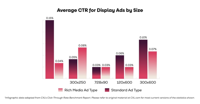
While larger banners might seem like the obvious attention-grabbers, the data reveals that standard ad dimensions like 160x600 actually boast the highest CTR at 0.15%.
Interestingly, both standard and rich media formats in the 728x90 size see the lowest click-through rates at 0.03%. It's a surprising twist in the pixel-powered game of display ads!
This data highlights the importance of testing different sizes and formats to find what resonates best with your target audience. Remember, it's not just about size — finding the optimal combination of format and dimension within the display network is key to unlocking its click-through potential.
Where to place ads for maximum clicks
Now, let's talk prime real estate: ad position. Imagine your ad fighting for attention on a bustling search results page. The chart below paints a clear picture of the click-through hierarchy.
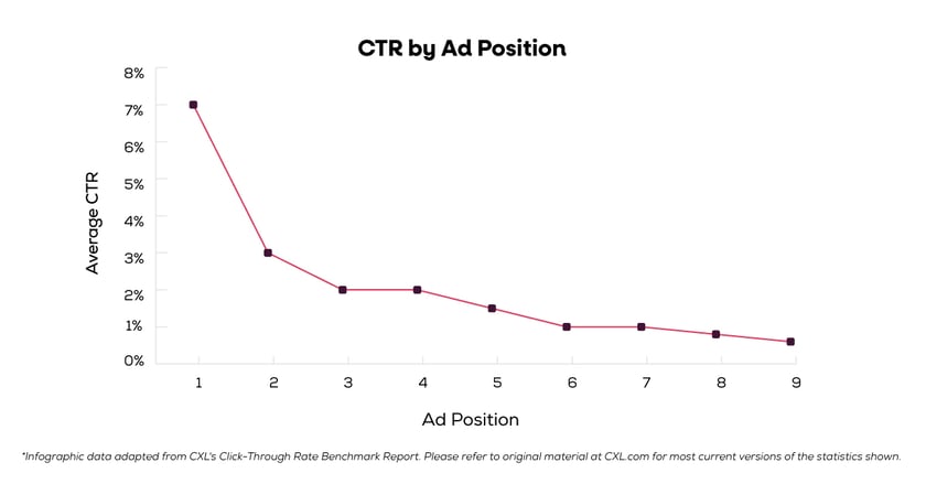
Studies show ads at the top routinely boast a 7.11% click-through rate (CTR), while those buried down in ninth place ring in at a measly 0.55%.
The takeaway? Never stop optimizing! Target the right keywords, write compelling copy, and get the most out of your advertising dollars. Remember, higher rank = more clicks = marketing magic.
Channel check: optimizing CTAs by platform
Not all platforms speak the same click-through language. Take a peek at the infographic and discover the diverse click-through rates across popular channels.
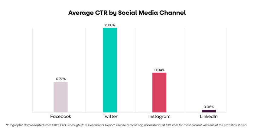
Twitter's chirpy audience, eager to engage, engages a 2.00% CTR, while LinkedIn's professional crowd, offers 0.06%. Don't despair, though! Facebook, the master of ad formats, proves variety is the spice of click-through life.
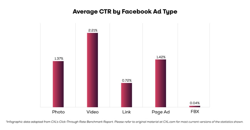
This infographic reveals — plain link ads might only rank with 0.72%, but their video counterparts, reel in an impressive 2.21% CTR — higher than Twitter's average!
Experiment with formats, climb the search engine ladder, and choose the channel that resonates with your audience.
CTA optimization tips for the future
Now that we've established average click-through rates as a baseline metric, how can we build upon those benchmarks?
Revitalizing underperforming CTAs
For underperforming CTAs:
- Rethink placement: Move those generic buttons lacking context to pages where they resonate more, aligning them with relevant content and boosting visibility.
- Embrace a fresh perspective: Give tired CTAs a creative makeover. Refresh the copy and visuals to re-engage users and spark interest.
- Test and learn: Compare underperforming CTAs to new variants to isolate the factors hindering their success.
Unlocking overachiever conversion potential
For overachieving CTAs with downstream conversion issues:
- Bridge the gap: Ensure a seamless transition from the CTA to the landing page. Deliver on expectations and build trust.
- Optimize the flow: Streamline the landing page experience by refining copy, offers, and forms. Remove friction and make conversion effortless.
- Unlock potential: Test different landing page elements to pinpoint what ignites downstream conversions and unleashes their full potential.
By implementing these strategies, you can elevate your CTAs from average to exceptional, driving meaningful engagement and conversions. Remember, it's not just about getting the click; it's about guiding users on a seamless journey toward their desired outcome.
The power of incremental CTAs
When crafting your next CTA, remember: start simple. Instead of immediately aiming for a purchase, guide users with logical first steps like viewing sale pricing or exploring specific product pages. This incremental approach fosters trust and establishes relevance before accelerating into bigger asks later.
Think of it like welcoming guests into your home. You wouldn't immediately ask them to buy your furniture, would you? Instead, you'd offer them a drink and show them around, allowing them to discover your offerings at their own pace.
This same principle applies to CTAs. Consider an email from an e-commerce retailer promoting a sale. Instead of a direct "Buy Now" button, leading with a clear "See Details" CTA invites users to explore the offer without feeling pressured.
While some may be ready to purchase immediately, most need time to understand the value proposition before committing. By focusing your CTAs on obvious next steps, you align with the majority of visitor mindsets and create a smoother user journey.
So, the takeaway? Craft progressive CTAs that are clear, concise, and logically guide visitors through their exploration. Make them one-step invitations to continue the journey, building trust and understanding along the way.
A CTA beyond the button
 Remember, the numbers above are just a peek, not the whole picture. Even with good clicks, there's always room to climb the click-through mountain.
Testing is your new best friend! Design, copy, placement, pages — everything's fair game. Every little tweak can be a click-through treasure, so never stop refining and optimizing.
And remember, a CTA is more than just a button or fancy link. It's a holistic journey that guides users towards the next logical step. Every element on your page should provide value and context, leading them down a seamless path. Think outside the box – how can you alleviate anxiety and provide that extra nudge towards conversion?
Ready to unleash your inner marketing master? Grab your free toolkit and start today!