
Table of Contents:
- What is ADA Compliance?
- Potential consequences of not meeting ADA standards
- Types of assistive technology
- Your ADA accessibility checklist
- 1. Start with a solid site map
- 2. Label all form fields
- 3. Use alt text on images
- 4. Include transcripts and captions for video and audio
- 5. Make CTAs specific
- 6. Enable keyboard navigation
- 7. Use semantic HTML
- 8. Use ARIA labels
- 9. Ensure proper color contrast
- 10. Use predictable, consistent design
- 11. Make accessibility part of testing
- 12. Use accessibility widgets
- Consult an ADA compliance expert
What is ADA compliance?
ADA compliance refers to following accessibility guidelines set by the Americans with Disabilities Act (ADA). While the ADA has standards for physical accessibility — things like automatic doors and ramps — they also have standards for website accessibility. In addition to the ADA, the Web Content Accessibility Guidelines (WCAG) is another organization that’s commonly referred to as a source for guidance on accessibility. Together, these organizations help outline how to make your website work for everyone.
It can be easy to assume that everyone can click, scroll, and see screens in the same way you do. However, of people in the U.S.,
- 3.2 million have difficulty seeing
- 3.2 million have difficulty hearing
- 3 million have difficulty processing information
- 3 million have difficulty with movement
Potential consequences of not meeting ADA standards
But first, what are the stakes for skimping on accessibility? In addition to losing business from millions of potential customers with disabilities, you may also land in legal trouble.- In 2023 , 4,605 web accessibility lawsuits were filed.
- 77% of lawsuits in 2023 were filed against companies under $25 million in revenue.
The good news: These potential consequences make the benefits even more significant. Improving website accessibility can increase your customer base, make user experience better for everyone, protect you from lawsuits, and improve your SEO.
Types of assistive technology
One more thing before we get into the checklist. When designing for accessibility, it's important to understand the kind of assistive tech some people with disabilities use online. Here are two of the most common to keep in mind:- Screen Readers: Typically for users who are visually impaired, screen readers convert on-screen text into speech by scanning a website’s code.
- Keyboard Navigation: Some users cannot use a mouse or track page and instead rely on navigating via keyboard commands.
Your ADA compliance website checklist
While accessibility guidelines will continue to change as technology does, this checklist will help you develop for the four principles of accessibility:
- Perceivable: Users must be able to perceive information in more than one way. I.e. screen readers.
- Operable: Users must be able to operate the website in more than one way. I.e. keyboard navigation.
- Understandable: Content must be clear enough that a wide variety of users (and assistive technologies) can interpret it.
- Robust: Content must keep up with developments in accessibility and assistive technology.
1. Start with a solid site map
Not all users can navigate your site by visual cues. Create a site map that makes sense for users who have to navigate it sequentially. Prioritize continuity in the user journey, making key information easy to find. In addition to being better for screen readers, this is just good UX practice.
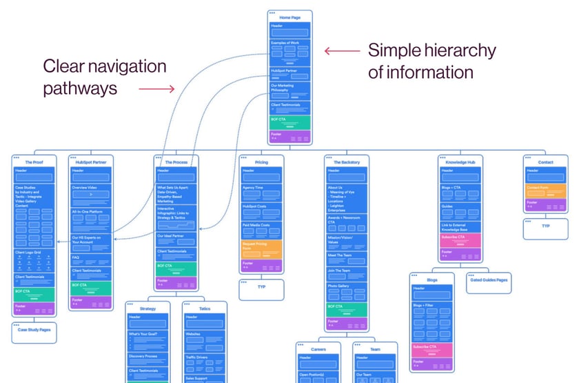
In addition to a site map that guides the structure of your site, you can also include an HTML sitemap page that shows users all their options at once and can help them find what they need. This is typically linked in the footer of your site.
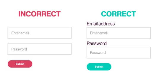
2. Label all form fields
It can be tempting to make forms more concise by only including placeholder copy within the form fields such as “email address” or “password.” But screen readers can’t read placeholder text, making it impossible for someone using one to correctly fill out a form. Easy fix: Label each form field above the field itself.
3. Use alt text on images
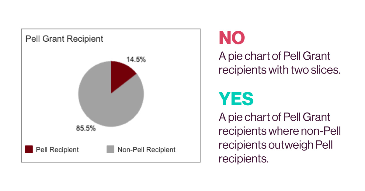
Alt text is a brief description of an image that will appear when the image does not — such as when the image doesn't load or when someone is using a screen reader. Alt text also helps Google pull relevant images when someone is searching via the "images" filter option. To write good alt text:
- Describe the image and be specific. It's not just a "woman pointing at a screen." It's a "Managed IT team member pointing to client's screen."
- Keep it short. Fewer than 125 characters.
- End alt text with a period (even if it's a fragment) to assist screen readers in knowing when the alt copy ends.
- Don't use ampersands as some screen readers need specific coding for ampersands to properly interpret.
- Use commas sparingly but as needed. Screen readers will pause when they encounter a comma.
- Provide context for complex images. For images like infographics, the alt text should explain the overall meaning and key takeaways.
4. Include transcripts and captions for video and audio
Transcripts provide a text version of audio, while captions display the words on screen. Without these accommodations, deaf users would miss out on the content completely. Plus, they allow audio/video content to be more easily followed in noisy environments or when audio is unavailable.
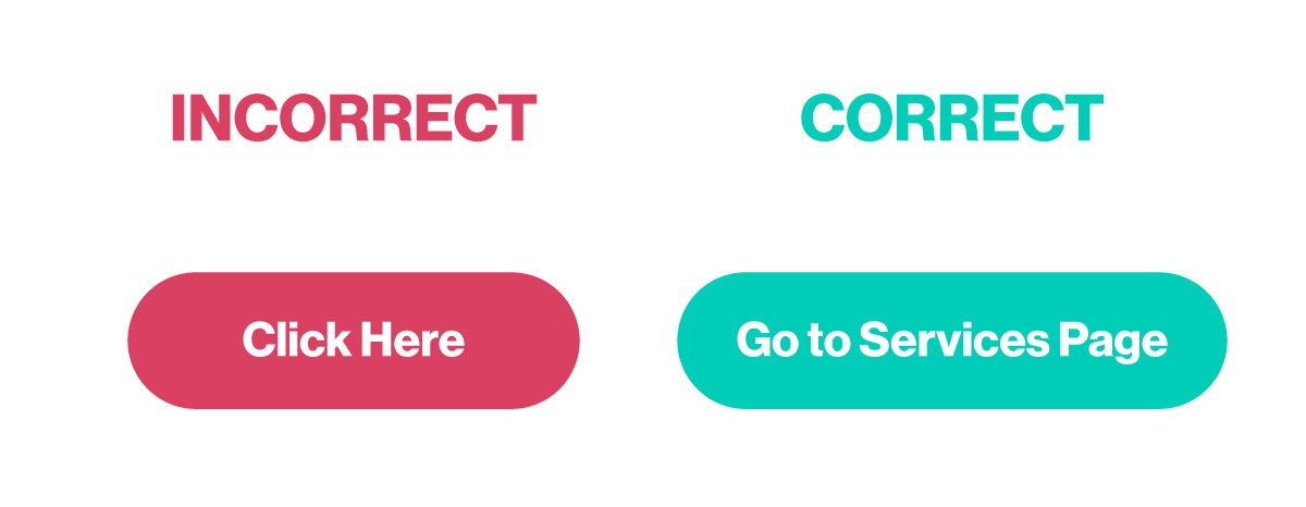
5. Make CTAs specific
This is just good practice. While visual context might help some users, phrases like ‘click here’ or ‘more’ are confusing and should be avoided. Instead, try things that make the destination of the link or button clear.
6. Enable keyboard navigation
Not everyone has a mouse or can use their mouse in the same way you can. Instead, people with visual or motor disabilities often rely on their keyboard. Ensure elements like navigation and sliders can be controlled by keyboard only using the tab and arrow keys. Enabling keyboard navigation is primarily achieved using semantic HTML. Keep reading to learn more.
7. Use semantic HTML
Semantic HTML involves using tags to designate the meaning and structure of web content. Screen readers don’t just read the visible text on a page; they scan the page's code. While visual clues help some users, clues within the code help screen readers convey the correct context. Here are some of the most common semantic HTML tags you should be using on your site:
<h1>, <h2>, <h3> etc.
Indicates different types of headlines on a page, making topics and transitions more clear.

<article>
Marks article entries and helps reduce <div> tags which can lead to invalid HTML. Plus, search engines often put more weight on any content wrapped with this tag.
<section>
Designates distinct sections of your content such as in a blog.
<header>
Indicates the header section of a page that typically contains navigation links.
<footer>
Specifies content in the footer section of a website such as company information and other useful links.
<video>
Not only indicates video content but also makes it possible to display videos without using Flash and includes information such as captions.
<aside>
Can be like a section tag, but one that focuses on secondary content such as a sidebar or a post-article CTA.
8. Use ARIA labels
Very similar to semantic HTML, ARIA labels provide additional context to elements on a webpage that might not otherwise make sense to someone using assistive technology. While HTML is the foundation, ARIA is the reinforcement for when HTML alone is insufficient. For example, complex elements, non-semantic widgets, and lack of visible text can necessitate ARIA labels.
ARIA labels fall into several main categories or “roles” that help define an element’s purpose. Here is some of the most common code:
role=navigation
Labels sections containing groups of links that allow users to navigate around the website or page content.
role=main
Specifies the primary, central content of the webpage that viewers want to access.
role=form
Identifies sections containing form controls like text boxes and buttons where users can enter and submit information.
role=search
Labels parts of a page that allow users to search within the website or page content, usually with a text input.
For icons, you may have to use a more nuanced type of ARIA label called aria-hidden. Some icons are purely decorative and don't convey meaningful information or actions. To avoid redundant or confusing output from screen readers, aria-hidden="true" hides the icon from assistive tech while keeping it visible on the screen.
For example:
<a href="#" aria-label="Visit Us On Facebook">
<i class="fa fa-facebook" aria-hidden="true"></i>
</a>
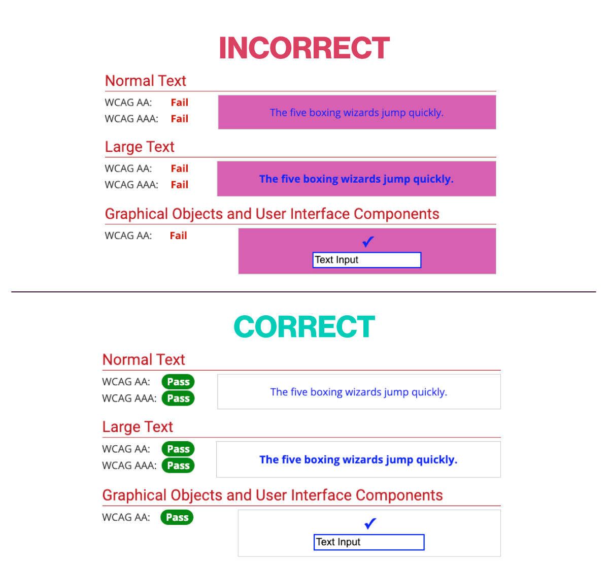
9. Ensure proper color contrast
To meet accessibility standards, websites must maintain a minimum color contrast ratio between text and background colors. The current WCAG 2.1 guidelines require a 4.5:1 contrast ratio for normal text and 3:1 for larger text. This higher contrast makes text legible for users with low vision or color deficiencies. Developers should test color combinations using online contrast checkers or browser tools.
Low contrast can make text appear blurred or washed out, rendering it extremely difficult or impossible to read for users with vision impairments. Following these contrast standards ensures all users can easily perceive and understand a website regardless of their visual abilities.
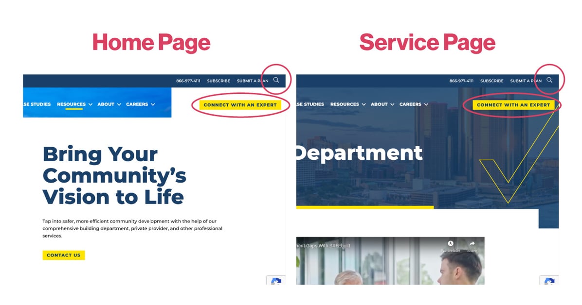
10. Use predictable, consistent design
Similar to an intuitive site map, predictable design helps reduce confusion for all users. For example, if the search bar on the home page is in the top left, it should stay there on all other pages. If a button labeled “Connect Now” takes you to a contact form, it should do that on all pages.
11. Make accessibility part of testing
Accessibility should be a regular part of all website testing. There are plenty of automated tools to help. Here are a couple popular options:- WAVE is a browser extension that can scan a web page and highlight potential accessibility issues, like missing alt text or low color contrast.
- Google Lighthouse audits webpages for accessibility alongside performance and SEO.
While automation is powerful, it's not a magic solution. Some aspects of accessibility require human judgment and testing with real users. Combined with automated tools, user testing can help ensure a strong foundation for an accessible website.
12. Use accessibility widgets
You’ve probably seen this icon in the lower right-hand corner of some websites.
![]()
It’s an accessibility widget that allows users to select different tools to help them navigate the site, such as highlighting certain sections of the site, increasing font size, and more. Here at Vye, we use accessiBE but there are other options to choose from. 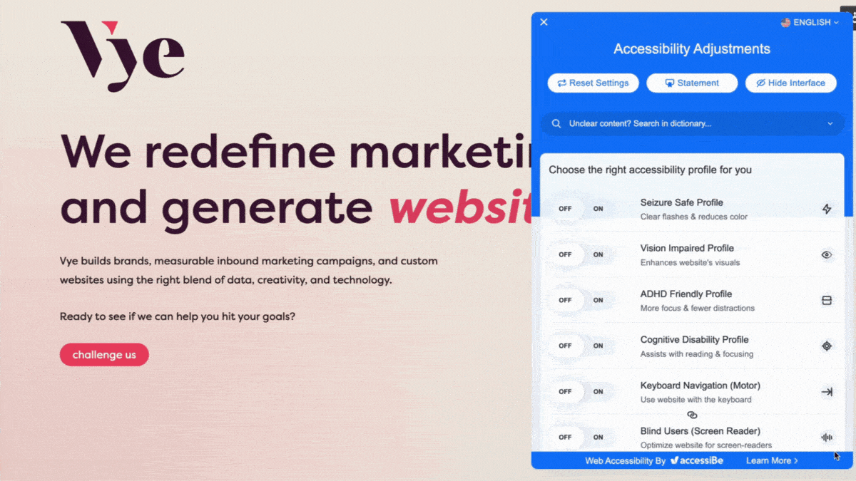
Consult an ADA compliance expert
There is a lot that goes into website accessibility. While there are easy things you can do to make your site better for everyone, other items might require some expertise to execute.
Check out our website capabilities to see what else is possible and reach out if you want to talk with one of our developers.