
Next time you're in line for coffee, peek over your shoulder — chances are, you’ll see faces illuminated by mobile screens. Smartphones have become an extension of ourselves. Did you know there are over 5 billion mobile internet users worldwide? That’s a whole lot of thumbs scrolling, tapping, and Snapchatting.
With this mobile revolution, optimizing your website for smaller screens is no longer a “nice-to-have” — it's a need-to-have. Research shows over half of website traffic comes from mobile visitors. Yet poor mobile optimization leads to bounced visitors, abandoned carts, and missed opportunities.
Luckily, you can tap into the power of HubSpot to create kickass mobile experiences. With their robust set of mobile-focused tools, you can build websites that engage users, wherever they are.
So let's talk about how to use HubSpot to build fast, frictionless mobile websites that delight visitors and keep them coming back for more.
Understanding mobile-first design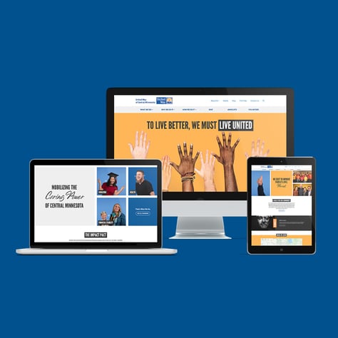
Mobile-first design means optimizing for thumb-friendly mobile experiences first, before worrying about desktop. It flips old methods upside down.
This approach works because mobile has unique needs. Smaller screens, touch interactions, and on-the-go usage all impact site design. Mobile-first forces you to cut the clutter for a streamlined, user-friendly experience.
While scaling up to desktop, the mobile-first foundation ensures a seamless, intuitive feel across devices. No more bolted-on mobile sites. Just thoughtful experiences tailored to the user's context.
Leveraging HubSpot for mobile web development
HubSpot's got all the mobile web dev tools you need to pump out stellar experiences. With responsive frameworks like Bootstrap, your site shape-shifts to every screen size with ease. The mobile preview tool lets you instantly preview pages across devices in just a click. And their templates give you mobile-optimized layouts, fonts, and CTAs out of the box so you can hit the ground running.
Together, HubSpot's toolbox provides an efficient, seamless way to craft mobile-friendly sites. You can streamline development instead of struggling with mobile adaptations.
Responsive web design in HubSpot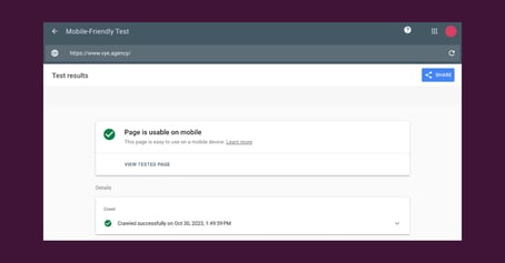
Responsive web design (RWD) detects screen sizes and intelligently serves up tailored HTML for each device, whether phone, tablet, or desktop. Images, text, grids — you name it — all reformat fluidly.
In HubSpot, use frameworks that handle responsive adjustments behind the scenes. Then focus on making images flexible, typography readable across devices, and whitespace strategic for seamless transitions between breakpoints.
Continuous testing is key to perfecting RWD. Leverage HubSpot's Mobile Preview, Google's Mobile-Friendly Test, and real devices to catch issues.
Speed and performance optimization
Quick, think fast! When you're scrolling on your phone, every second counts. Mobile users have no time for slow-loading sites.
Luckily, HubSpot sites come speedy out of the box. But you can — and should — take it even further. Optimize those image sizes and cut down code bloat. Minify CSS and JS files so they move at the speed of light. Enable caching so elements save time by not reloading.
Test speed with Google PageSpeed Insights and HubSpot's own Performance Tool. Set a 3-second load budget and stick to it like glue. Monitor speed across real devices too, just so you get the full picture.
Mobile-optimized content and UX/UI design
 When designing mobile content and UX, remember tiny text is a big no-go. Follow these tips:
- Use short, scannable paragraphs. Mobile readers want brevity.
- Leverage succinct headings, lists, and bolding to guide readers.
- Break up long-form content into tabs or accordions.
- Adopt familiar navigation patterns and layouts.
- Streamline menus, search, and CTAs for intuitive clicking.
- Test across real devices before launch.
With mobile-optimized content and UX, you'll craft frictionless experiences and loyal users.
Mobile SEO best practices
Google rewards mobile optimization with better search rankings. Luckily, HubSpot gives you built-in SEO tools to make it happen:
- Optimize site pages and metadata for small screens.
- Turn on the mobile-friendly switch.
- Validate with Google's Mobile-Friendly Test.
- Trim page load times since speed matters.
For WordPress users, leverage mobile SEO plugins too. With HubSpot's tools, your mobile search rankings will climb as users find you easily through organic results.
Testing and quality assurance for mobile websites
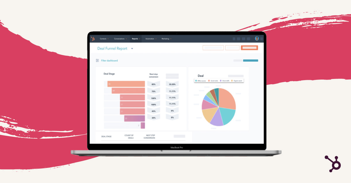
Testing mobile sites is like a treasure hunt for bugs — every find improves your user's journey. Equip yourself with real devices, BrowserStack-like emulators, and HubSpot’s mobile toolkit. Inspect everything — from forms and CTAs to navigation and speed. But don't just stop at Mobile Preview. The real gold lies in monitoring analytics and conducting user tests for continuous UX enhancements.
Let's build the future together
 The mobile revolution is here and only gaining momentum. Luckily, HubSpot equips you with the tools to thrive in this era. By embracing mobile-first and optimizing relentlessly, you can craft fast, flawless experiences.
Now let's build the frictionless mobile future, hand in hand with your customers.
Want even more mobile marketing resources?