Hear the story straight from City & County

Unique brand = unique look and feel
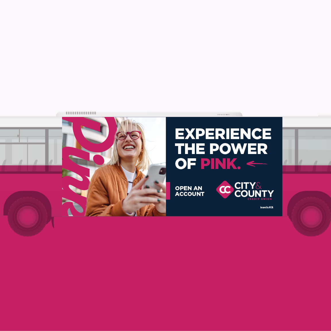
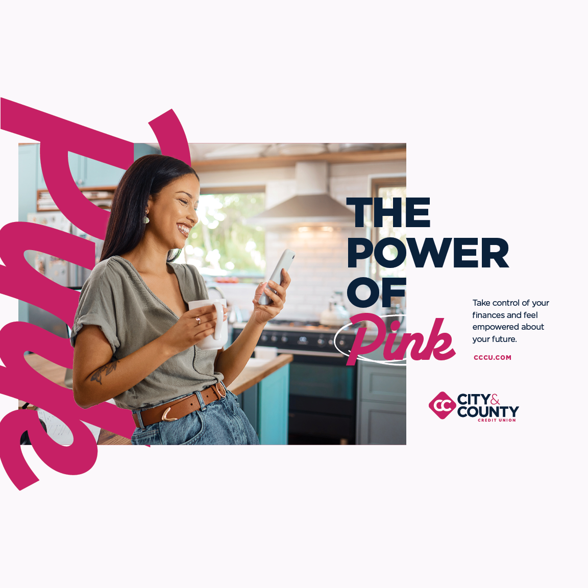
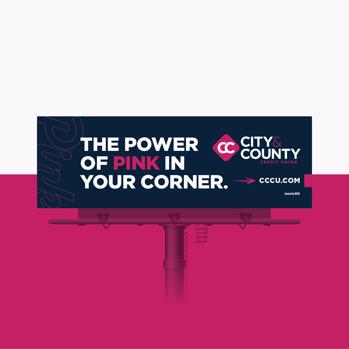
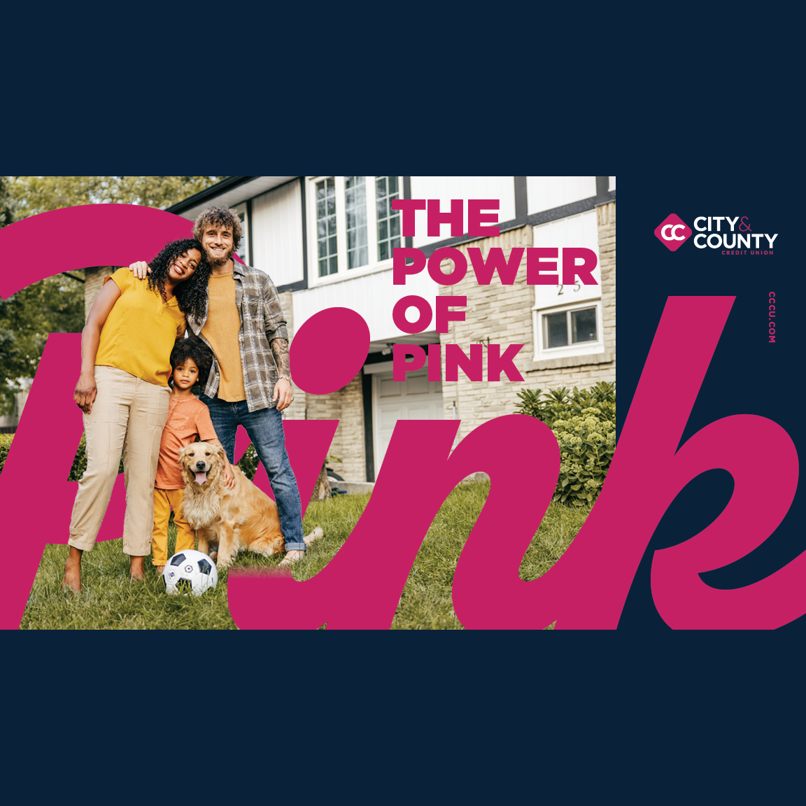
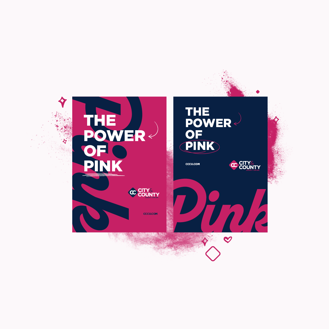
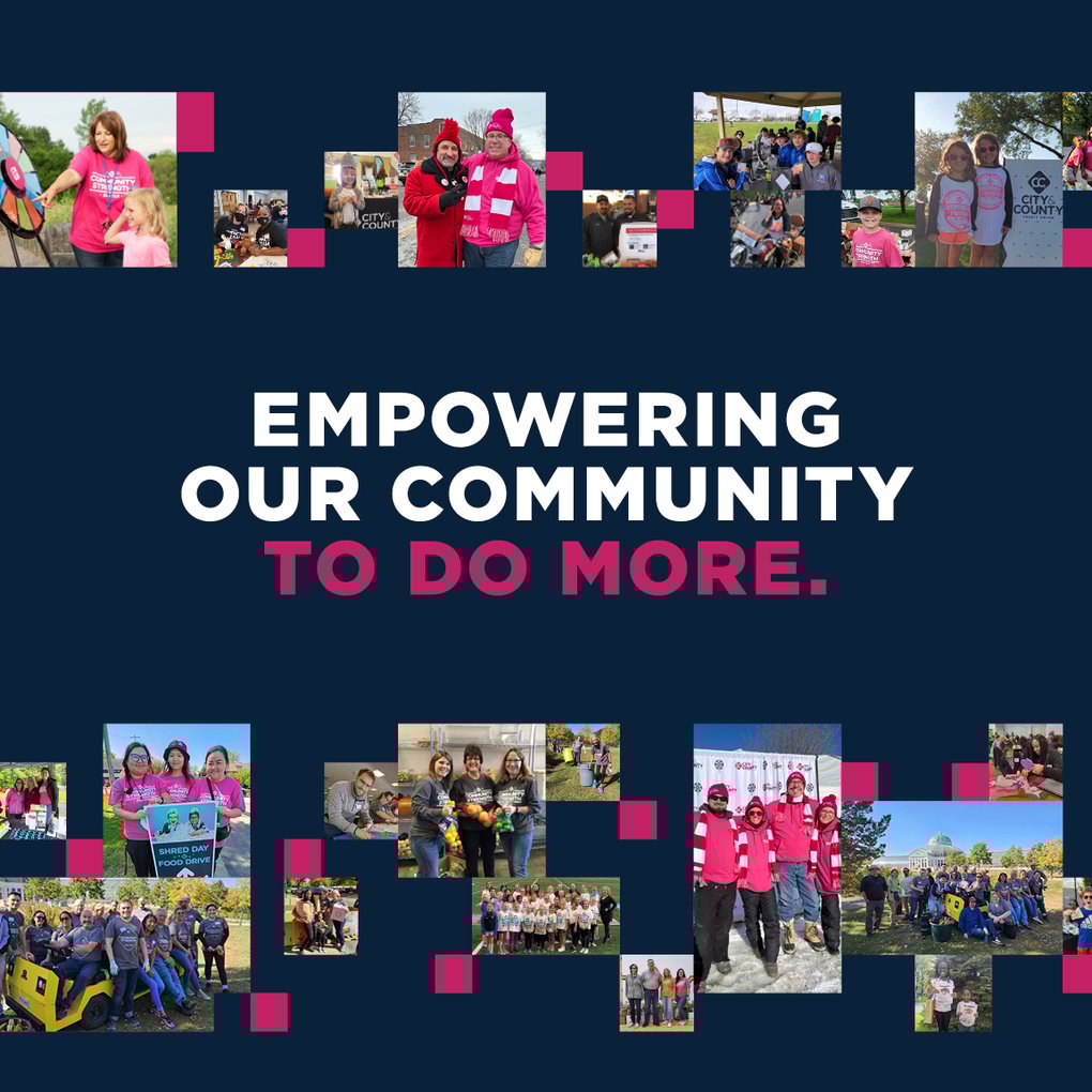
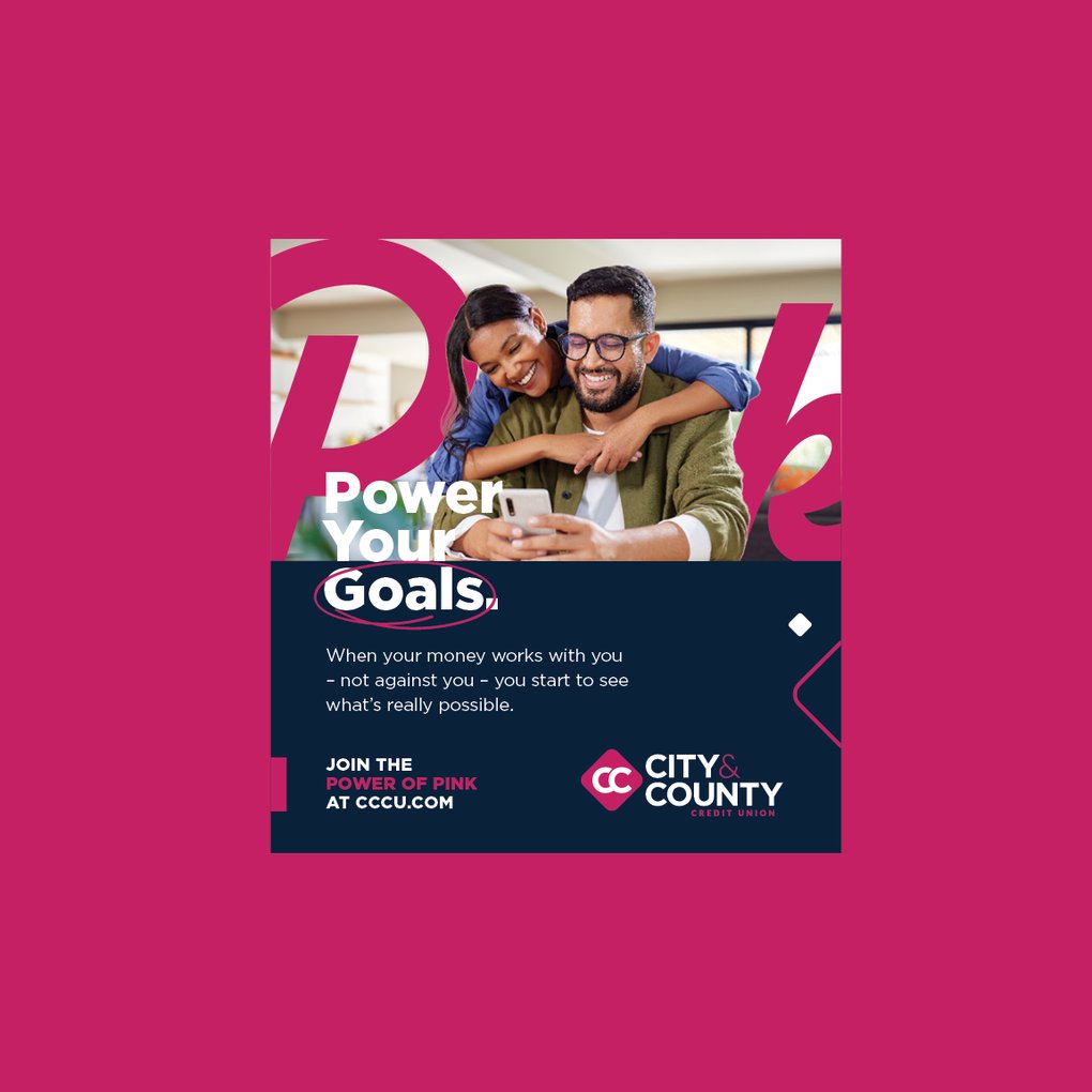
Our team cooked up a little concept called "Think Pink," which quickly grew legs and started running. What began as a campaign catchphrase has transformed into their entire brand identity — not just how they look, but how they live and breathe as an organization.


.png)


Think Pink meets smart strategy
While the "Think Pink" rebrand got people's attention, it was our paid media strategy that turned those curious clicks into real members.
Google Ads drove over 6,800 conversions in Q2 alone, creating nearly 1,000 new contacts in the process.
Even better? We spent 35% less while hitting these numbers, proving that smart targeting beats big budgets every time.
Got a brand dilemma?
We love to maintain the integrity of a brand while giving it a whole new life.